Chiproof
A B2C platform that provides users with quality housing at affordable terms.

Project Details
Timeline: January-March, 2023
Role: User Experience Designer
Team: Project Management, User Experience Design
Overview
Chiproof is an up-and-coming property renting platform that aims to combat the hassle of Nigerians finding property based on their income, The company is currently getting ready to launch its online application, which will provide consumers with options such as rent financing.
Problem
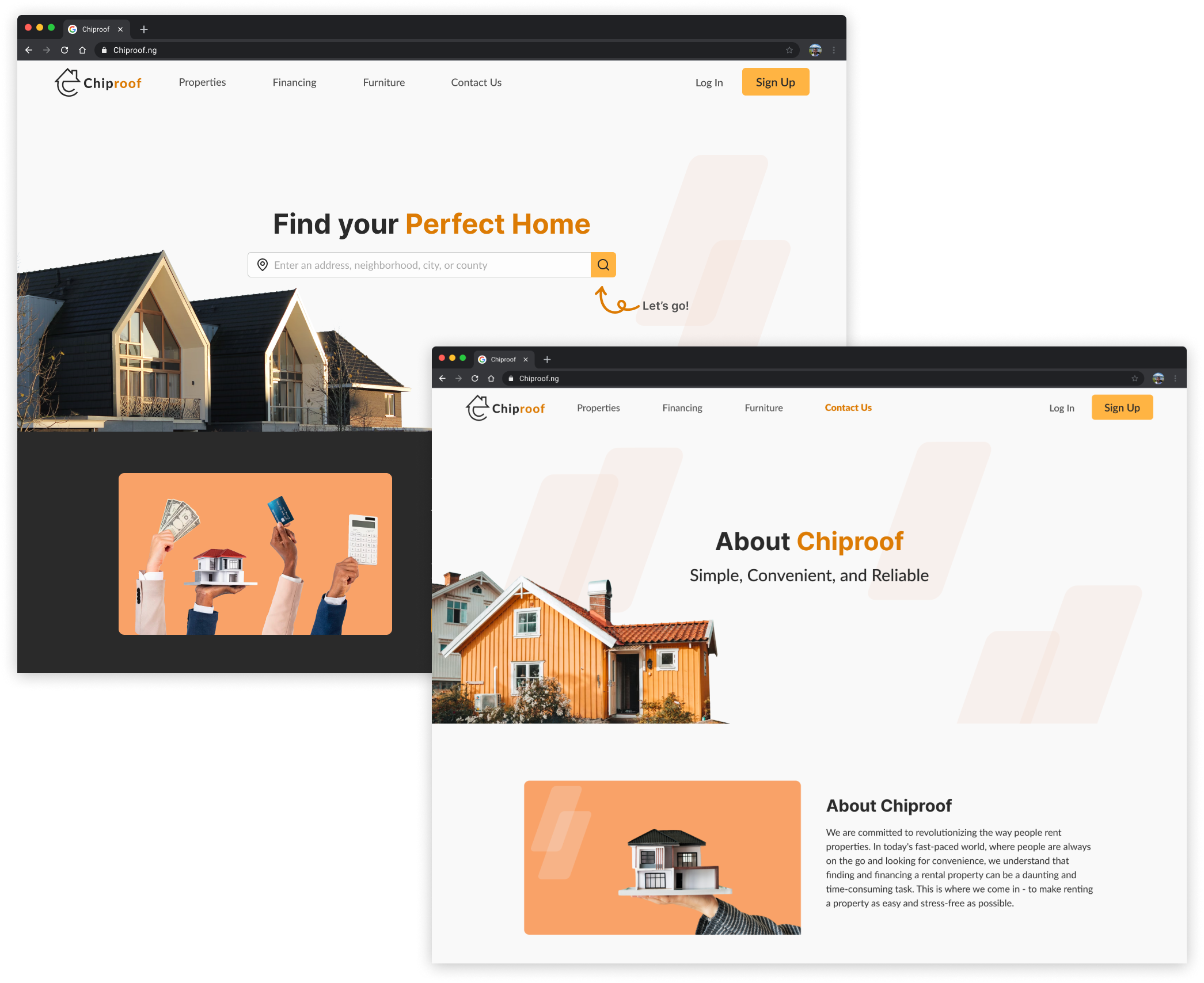
The client requested a user-friendly webpage that showcases the company's services, allows quick home searches, and offers financing applications for rentals based on salary. The webpage should cater to students, professionals, families, and retirees.
Solution
The web application will feature key elements including:
Easy-to-use interface: Helps users explore Chiproof's services.
Affordability Calculator: Lets users input their monthly income to see properties within their budget.
Rental Finance: Provides funding options for rent payments.
Design Process

Discovery
Project Kickoff
Before starting, our team met via Zoom to review project details, expectations, and communication tools. Noting different time zones and availability, we decided to use Slack for daily communication to address any questions or concerns easily.
Client Brief
The team received a detailed client briefing that outlined the client’s needs. During our kickoff meeting, we reviewed the project scope. The main goals were to design a property listings page where users could search by pay range, a rent financing applications page, an About page, and a Contact page.
Client Question
Recognizing the need for a deeper understanding of the client's needs, our team developed questions to explore their expectations further. We were committed to exceeding customer expectations and meeting their goals while developing the web application.
Some questions asked were:
What inspired you to create and build this startup?
What makes Chiproof unique and stand out compared to other companies?
Does the customer have to get pre-qualified to rent a property?
Is there any specific style guide/websites that you like?
Ideate
User Stories
Before starting the design, we identified key functions based on 5 user stories provided by the client. The client later asked us to focus on rent financing and remove furniture financing from our plans.
As a user, I want….
To be able to access the website to understand what Chiproof is about.
To be able to view property listings
To be able to fill out an application for rent financing.
To be able to contact the company.
To be able to learn about furniture financing.
User Flows
We created user flows based on each story to determine how screens should be laid out for task completion. Despite the removal of the furniture finance page, we identified 7 essential routes for the product.

One of the many user flows designed
Mid-Fi Wireframes

My teammates and I took on our assigned screens to design. I was in charge of designing the rent prequalification screen. We designed our medium-fidelity wireframes using Figma with the goal of creating screens that were simple for users to easily navigate through.
Design
UI Inspiration
When looking for inspiration for the rent financing page, my primary focus was on three key aspects: simplicity, clarity, and accessibility. I aimed to create a user-friendly interface that would streamline the rent finance process. Simplicity was crucial to ensure a straightforward and intuitive user experience, reducing any potential confusion or complexity.

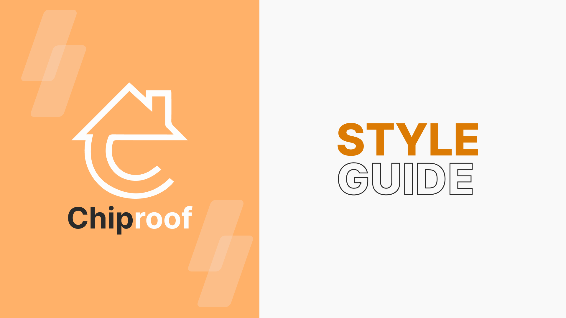
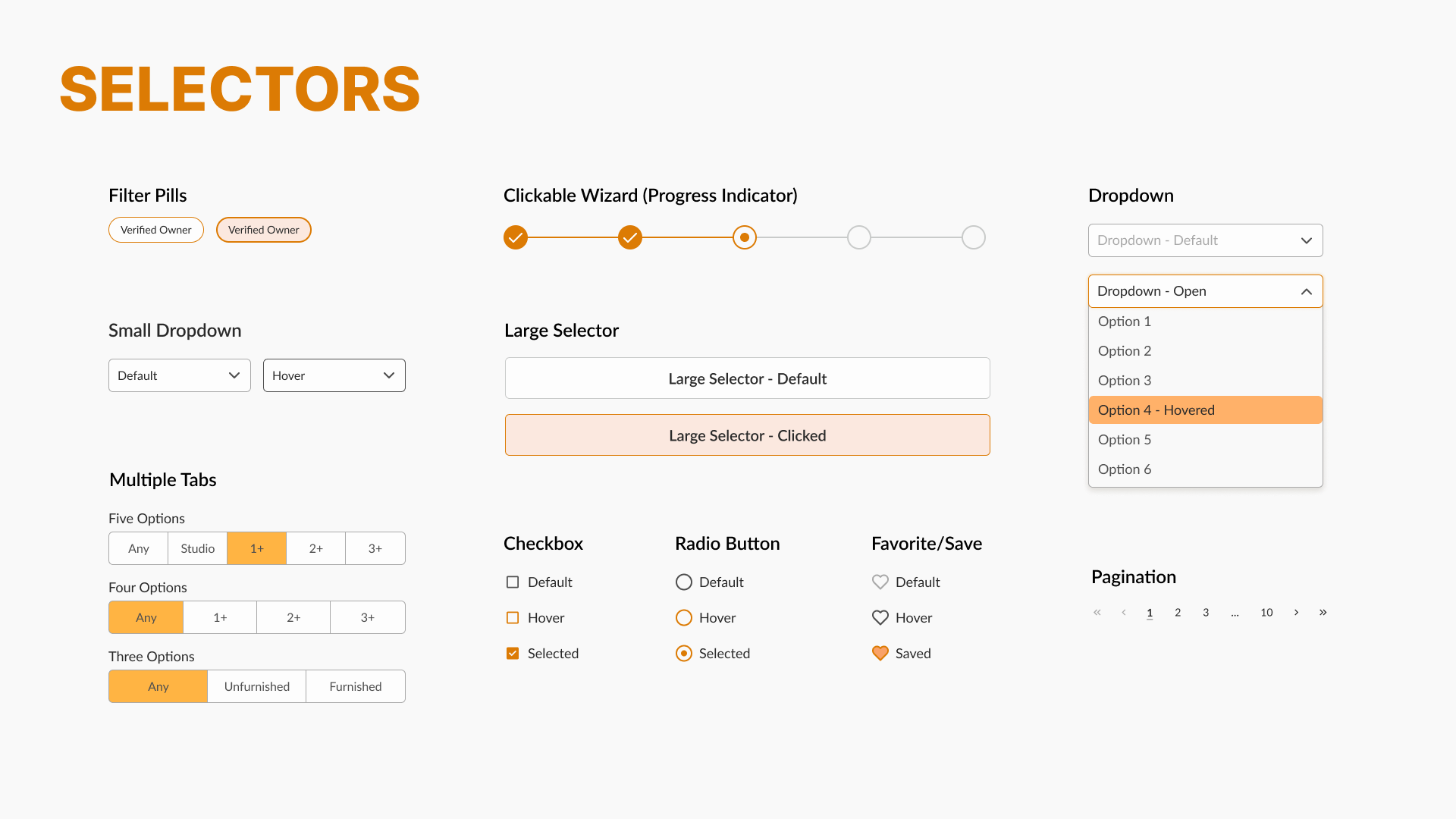
Style Guide
Our style guide served as a foundation for maintaining a consistent and cohesive visual identity across all design elements. It includes guidelines for typography, color palette, iconography, and layout, as well as rules for creating accessible and user-friendly designs.